Our task
Navigation
towards America
We have been accompanying Naviswiss and their innovative surgical navigation system for several years now, with a focus on European climes. The product miniaturizes and simplifies orthopedic procedures and enables optimal planning and execution of surgeries, making it attractive to physicians - including those in the Americas. So as the coordinates become more focused on the U.S. market, we prepare the brand for its compelling overseas presence.

Corporate Design goes global
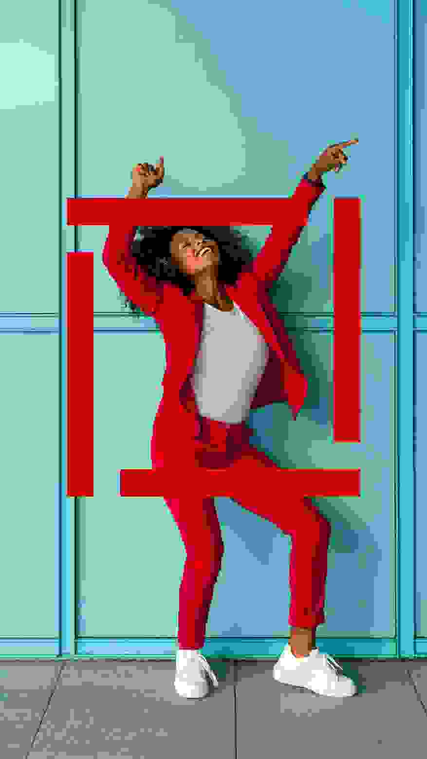
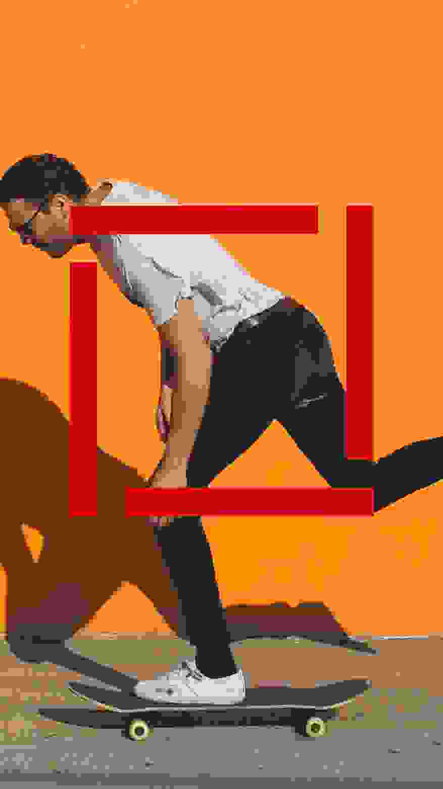
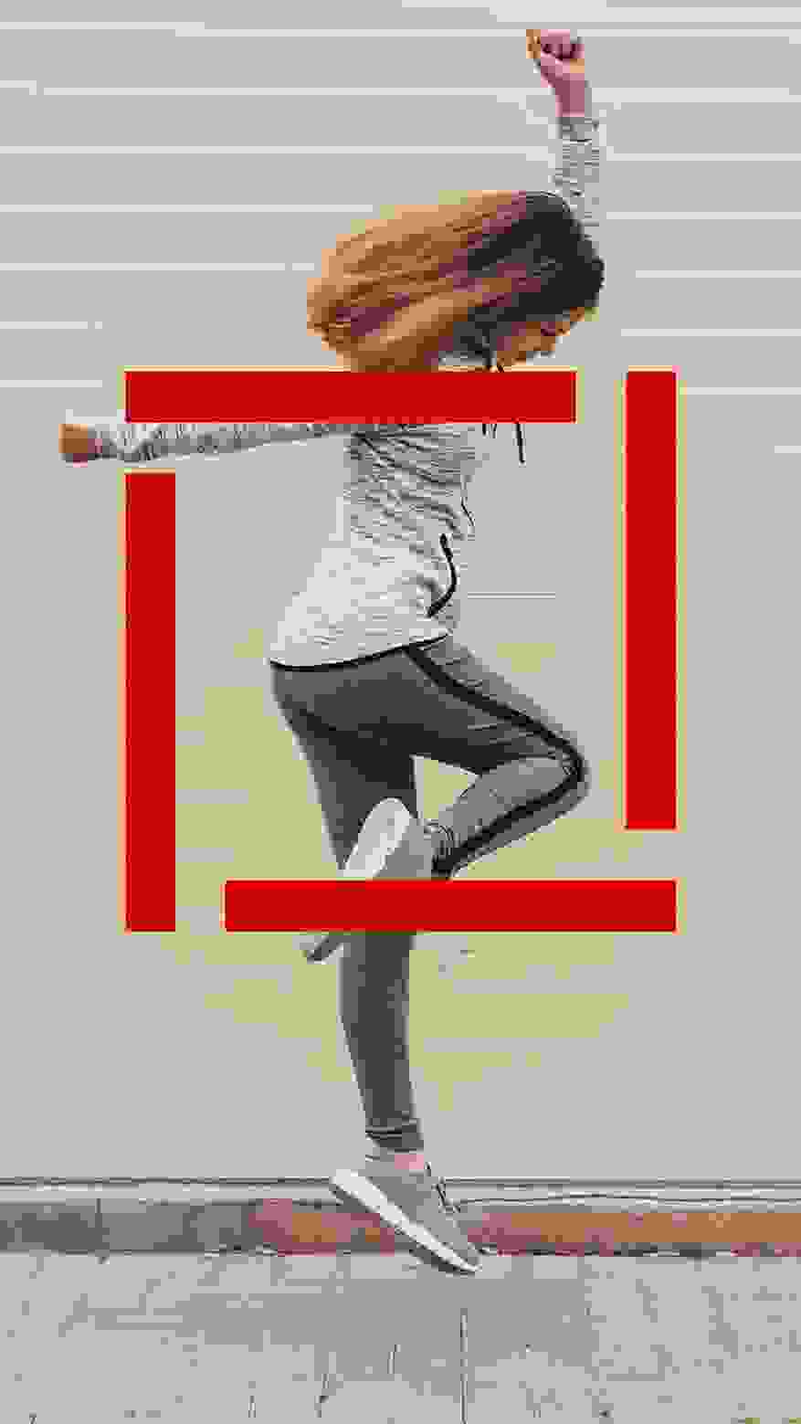
Since the U.S. market requires a completely different approach, we're taking it up a notch, becoming more direct and eye-catching, and focusing on call-to-actions and lead generation. To do this, we adapt the design and imagery, define concise key visuals and literally give the brand a strong red frame. While «boldness», image and emotion stir up the corporate design, we reduce its application for all Naviswiss employees worldwide. In cooperation with our American colleagues, we succeeded in standardizing the corporate design, which ensures a globally successful appearance.


More feeling with storytelling
We use the opportunity of a product launch to build consistent storytelling. This includes the placement of the products, their communication and their naming, which is now based on a solid, plausible and uniform naming concept. We respond proactively to the current demands of the market by addressing the target group directly and in a needs-oriented manner. In our role as an accompanying, consulting partner, we give Naviswiss the means to finalize projects independently - just as they do with their products.
Icons for 3 USPs


Big in Las Vegas
Even though Naviswiss stands for miniaturized technology, one is allowed to «go big» for a change. The American Academy of Orthopaedic Surgeons (AAOS) trade show in Las Vegas, the event par excellence for orthopaedics, proves to be a fitting venue for the big undertaking. To this end, we work with the customer to conceptualize the trade fair design in terms of both visuals and content - and stand out. With an 8x4 meter tower and a lot of «boldness», Naviswiss has finally arrived on US soil for all to see.

Deviation allowed - in the OR and our implementation
